TL;DR?
- Name your photos with a numerical prefix that sorts in event timeline order.
- When you process, save as VERY LARGE filesize. The book template will tell you the pixel sizes of the various layouts.
- Think in two-page spreads.
- Proof at 100% two-page layout size, on a large monitor.
- Allow several hours to upload the final file when you are ready to purchase the printed copy.
DIY Wedding Album Using Blurb
When we met with our wedding photographer, he brought an example of the kind of album he could create for us. It was beautiful, on heavy stock, full of wonderful pictures of the wedding and the reception. The price was out of the budget. I said, “Thanks, but no.”
Sometime afterward, I realized that the album could span the entire year of the wedding planning, from engagement to honeymoon. We were not limited to using only the photographer’s images of getting ready, the wedding, and the reception. It was our book. I had photographs covering the period from our engagement right on up to the dinner party two couples gave us as a wedding present.
The album very quickly became The Year of Our Wedding, and in truth, 18 months.

Gather the Pictures
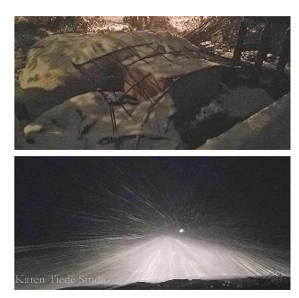
I had a few pictures from the engagement, a few from the total solar eclipse in July, and lots of pictures about making all the flowers and painting lace and building decorations. I made sure to take pictures on that awful last Wednesday before the wedding, when it snowed 6 inches and I had to drive from my house to my husband’s house in a snowstorm when there was virtually nobody else on the road and all the gas stations were closed along the way.
Download Book Software
When I received the pictures from the photographer after the wedding, I started to think about the album. I looked at some of the consumer-level templates and photograph book systems, and none of them appealed. They were just a little too cute, with garnishes and embellishments and framing devices to make the pictures stand out and suggestions for captions. It wasn’t what I had in mind.
I can’t remember where I first heard about Blurb. I know I had looked at them before because I had an account on their site. I liked their options. I downloaded their BookWright software to my PC, so as to not do photo work on a slow internet connection, and got started.
Organize and Edit Pictures
First, I sorted the files that our photographer had sent us, selecting images for the album. They were moved into separate file folders. I added my images, my sister’s images, and pictures from guests. These images went into Photoshop Elements in batches, for cropping, tweaking, and erasing background bits and pieces. A few Exit signs in back of heads disappeared, as did empty cans on tables. Just clean it up a little bit. In some cases, photos were merged, so that everyone in a group shot was smiling equally.
I saved all the pictures in batches, with names that indicated their part of the wedding: getting ready, portraits, the ceremony, the toasts, dancing, etc.
Blurb (and all of the online book publishing systems) offers pre-designed starting point templates. Perhaps it was a Bridezilla attack, but none of them suited. They seem to have a very limited range of photo layouts. In the end, I created my own template, cutting and pasting every layout from every example book into one master. I don’t understand why the system didn’t offer this option. (The final book uses 21 different layouts.)


Create the layouts
Once I had the template set, I uploaded the pictures and immediately encountered two problems: layout limits, and photo sort options.
First, it is very difficult to move individual pages around in a book. Pages are designed in two-page spreads that have to move together. I’d start a page, and realize that it actually belonged later in the event, and try to drag-and-drop, and mess everything up. (I should note here that the final book file was 700 MB, and I was stressing my PC to keep track of everything.)
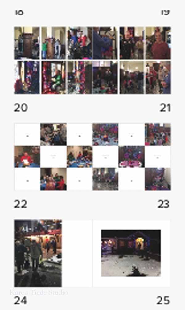
Second, sorting options were limited. Blurb, and probably all systems, allow sorting by photo name, or date modified, date taken, or date imported. I did not edit my pictures in event order. I had named them logically to me, but those names did not sort in alphabetical order. Four different cameras provided “date taken” timestamps.
Therefore my photos were virtually randomly arrayed across a slider that showed 12 pictures at a time, out of 275 used in the final book. I realized immediately that I would be zipping back and forth and forth and back and back and forth for weeks looking for exactly the right picture, and I would still miss some. This wasn’t going to work.

The naming convention had to change. I deleted all the pictures from BookWright and sat down with a bulk renaming utility to preface all of the image names with a two digit number (which grew to a three-digit number) that indicated where the pictures belonged in the timeline between engagement and wedding gift dinner party. Then I uploaded everything again, working in batches as I moved through the events of the wedding.
In other words, engagement.jpg became 001_engagement.jpg, and honeymoon23.jpg became 120_honeymoon23.jpg.
Edit the book and the images
After I got the majority of the pictures uploaded and arranged the way I wanted I realized that the little orange exclamation point (!) in the corner of many far too many of the pictures indicated that Blurb thought the individual photo files were not large enough to print well. I am used to working on web display, and not at 300 DPI on a 22 in, two page layout.
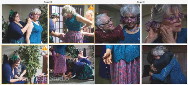
In other words, albums need BIG photo files.
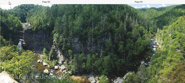
Some pictures were simply going to be low resolution. Some of the pictures were taken by other people, some were taken late at night and were fuzzy. Some of the more important pictures got reprocessed, including the panoramic layouts of the Blue Ridge Parkway vistas.
I think that understanding the size of images a book requires is simply a “second book” problem; there was no way to have guessed this in my initial processing. That is, the edited images were saved to a 2000 px width; that’s bigger than any website application, even for header and frontpage images. It’s not big enough for print.
Proof the Virtual Book
The first printing of the book was finished under a Christmas gift deadline pressure. I proofed a digital copy, on my screen, and then sent it to the printer to be delivered before Christmas. As is true for most deadlines, more time would have been useful. There were two instances of duplicated pictures that I did not see until I reviewed the printed book, and one case of a PDF that got cropped because the software aligned maximized one dimension and not the other. I simply didn’t notice it. My mother loved the book anyway and didn’t notice the duplicated pictures.
If you’re working under deadline pressure, know that uploading the book file to Blurb’s website when you finally order the printed copy is a significant chunk of time. A 100-page photo book is an 800 MB file, and that does not go up quickly. Allow several hours, which may affect the deadlines needed to get the book on time if you want to use inexpensive shipping options.
For the second printing, I fixed the duplicated pictures and the cropping, added our ceremony text including vows, and added some additional layouts, such as maps of the Blue Ridge Parkway, which we rode on our honeymoon. I also added an index with the full names of everyone in all of the pictures. John and I sat and identified everybody in the balcony. (Is there software to create an outline of the heads so that they can be linked to a numbered list?)
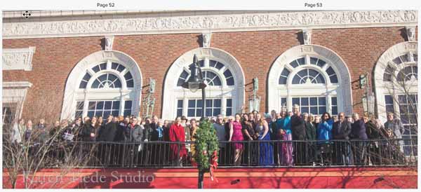
Getting the document that contained the index into the book was hard; the upload kept breaking a two-column layout. In the end I created a PDF of the Word document index, uploaded that into Photoshop, and converted the PDF to a JPG.
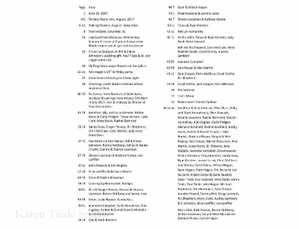
I work on a 17-inch laptop, which feels big, but is still smaller than a 22 in, two-page spread. Were I to do book design more often, it would be useful to review on a large screen system even if I had to borrow it. It’s simply not possible to grasp how it all comes together on the page, when you’re working at a less than 100% full page layout.
Now, that’s acceptable to me; we made a number of decisions about the wedding that allowed us to hit a particular budget point. A DIY wedding album that was cost-effective was simply one more of those decisions.
I did not keep track of the time I spent on the album. At my normal billing rate, it would have been cheaper to pay the photographer to produce it. He could not, however, have produced an album that documented our engagement all the way up to the end of our honeymoon and a dinner party after that.

The final book was just under 100 pages, with 275 images. I used 21 layouts. It cost $140 to print one copy (discounts apply to more than 4, or to your first printing).
